Showing posts with label oil painting. Show all posts

Tuesday, 22 January 2013

Painting No. 29 - High Neb Buttress, Stanage Edge

Oil on canvas 12" x 16"

This is based on a photo I took while out walking from Hathersage with the family one January.  It is fairly unaltered apart from the introduction of one of the many abandoned millstones that litter the slopes of Stanage Edge.  I also changed the colours of the climbers and added the standing figure.

Millstones below High Neb Buttress (photo from here)


I'm very pleased with the overall effect. I took some effort to get the edges right.  The gritstone tends to weather with rounded edges.  Whilst I didn't manage to stay as loose as I'd originally intended I believe that I've managed to capture the texture of the rocks and the feel of the place.

This will be going into an exhibition up in the Peak District on Feb 14th 2013, along with Trofeo Kima Rocks and Windgather.

Friday, 2 November 2012

Painting No. 25 - Trofeo Kima Rocks

Oil on Board 18" x 12"

Another one for the runners and mountains series.  This is based on the excellent photograph by Ian Corless (host of TalkUltra) taken at this year's Trofeo Kima event in Italy.  This event is conducted at high altitiude and involves an element of climbing using via ferrate chains and cables.  It is very spectacular and is typified by this picture, all cloud and rocks.  Ian's photos from the event can be seen here: http://iancorless.org/photography/trofeo-kima-2012/ .

I chose to do this picture for its mixture of textures with the ephemeral nature of the clouds and the solid ruggedness of the rocks.  It's almost an amalgamation of two of my previous paintings "Aldbury in the Spotlight" and "Joss Naylor, Wasdale, 1970's".

I only made two alterations from the original photograph.  I moved the runner further up to place him closer to the golden mean rather than in the centre and I added the red and white way marker to help create a diagonal running through the runner's gaze to the marker, to compliment the diagonal of the rocks.


I've also started to use a new signature or monogram after getting some negative feedback on my usual scrawl.  After experimenting with wren (the bird) graphics I opted for making use of the fact that my names and the year all consist of 4 characters resulting in this:

MICK
WREN
2 0 1 2

Not revolutionary I know, but at least I can be consistent now and it looks like a Chinese hieroglyphic from a distance.

In terms of the process I went through, I started with a quick pencil outline then blocked it in with diluted monochromatic paint.  It was then a case of around four passes over each part of the painting refining in finer detail each time.  I paid especial attention to the values on this one to avoid loosing the runner against the background.  After putting down the overall shading on the rocks I again resorted to the painting knife to provide the variegated look and texture.

Overall, I'm very pleased with this.  I believe that I have achieved the aerial perspective I was looking for and have learnt a lot in doing it which is always good.

Update 11/11/12: Finally found the trofeo Kima 2012 results.  The guy in the picture is Marco Zanchi.  Here's a video of him being interviewed (hope your Italian is up to scratch).


Wednesday, 25 July 2012

Painting No. 22 - Joss Naylor, Wasdale, 1970s


Oil on board. 24" x 24"

I've been planning to do this one for quite a while now, every since I saw the original photograph on the cover of the Keith Richardson book 'Joss', a biography of the fell running legend Joss Naylor MBE.


The photograph is by the late Brian Duff so I had to obtain permission from his family who own the copyright to be able to paint it. 

There were clearly some challenges here.  Firstly, once again it's painting from a photograph and not real life.  Secondly the photo contained more than the usual mix of photographic distortions not least of which is the massive foreshortening which brought the background hills much closer than they appear in real life.  Also, how did he get that haze around Joss? This was in the days before Photoshop.  Finally, it's monochrome so I was going to have to decide on the colour scheme. 

This painting is important to me as it is in the genre that I want to specialise in: mountain activity scenes, and it is of a real celebrity in the fell and ultra running circles in the UK.  I have plans to hopefully use this painting to raise some money for charity. 

So, I had to plan this one carefully.  I started by getting used to the image by making some pencil sketches. 


The face was a mass of shadows making it difficult to extract any detail but there was just enough to work with.  I then did a value sketch in oils on a 10" x 10" board, as the tones within the picture were vital to making it work.  I was particularly keen to get the figure to stand out against the background. 


Before doing this I had to choose the composition.  I tried various positions with Joss on the left, in the centre and finally chose the one above with him appearing to run into the picture from the right hand side.  A square shape also seemed to suit the composition within a nice diagonal running from top right to bottom left.  His arms are on the horizontal golden mean whilst the left hand side of his body (his right) is on the vertical.

Next I  had to decide on what colour his kit was.  I tried various combinations, using a scanned image and Microsoft Paint, before going with a dark blue top and red shorts.  I couldn't make out the type or make of shoes he was wearing in the photograph so I changed them to the classic Walshes which he typically wears.


Now I was ready to start.  I'd originally intended to do this on stretched canvas but the one I bought was too cheap and nasty so, being too impatient to source a decent one, I cut and gessoed a piece of board.  I then drew the main outlines in pencil onto the gesso, using grid lines in the more detailed areas such as his face.  I blocked in the main areas using a dark red wash then proceeded to add the colours. 

As I was doing the background it struck me that there was a lot of interesting detail missing on the original photograph.  As a fell runner myself I like to be able to make out the paths and features that are so familiar to me.  So I found some reference photos and proceeded to do a reasonably detailed background, knowing full well that I'd have to fade it out by scumbling to the required tone to make it recede.  This has worked quite well as the detail is still to be found through the haze.  For example the path up the western flank of Great Gable can be seen under Joss's right arm.  That brings back memories of battling up there in a monstrous gale in the 2008 OMM (Original Mountain Marathon).  (See this video at the 2:08 min mark to see the conditions). 

This painting includes my first use of a palette knife.  I used it to obtain the markings on the rocks in the foreground.  Interestingly, I paint with brushes with my left hand but use the palette knife with my right. Very strange but I do like the effect it gives.  Perfect for those rocks. 

I did two passes of the whole figure, making sure the values worked, until I reached the point where I thought doing anymore would spoil it.  Overall I'm very satisfied with the effect.  I managed (in my opinion) to get the figure to project out of the painting.  The end result is not yet where I want to be as a painter but I get the impression that painter's are never satisfied so for now I'm happy with the end result.  I hope others like it.

Sunday, 3 June 2012

Painting No 20 - Aldbury in the Spotlight


Oil on Canvas Board  18" x 24"

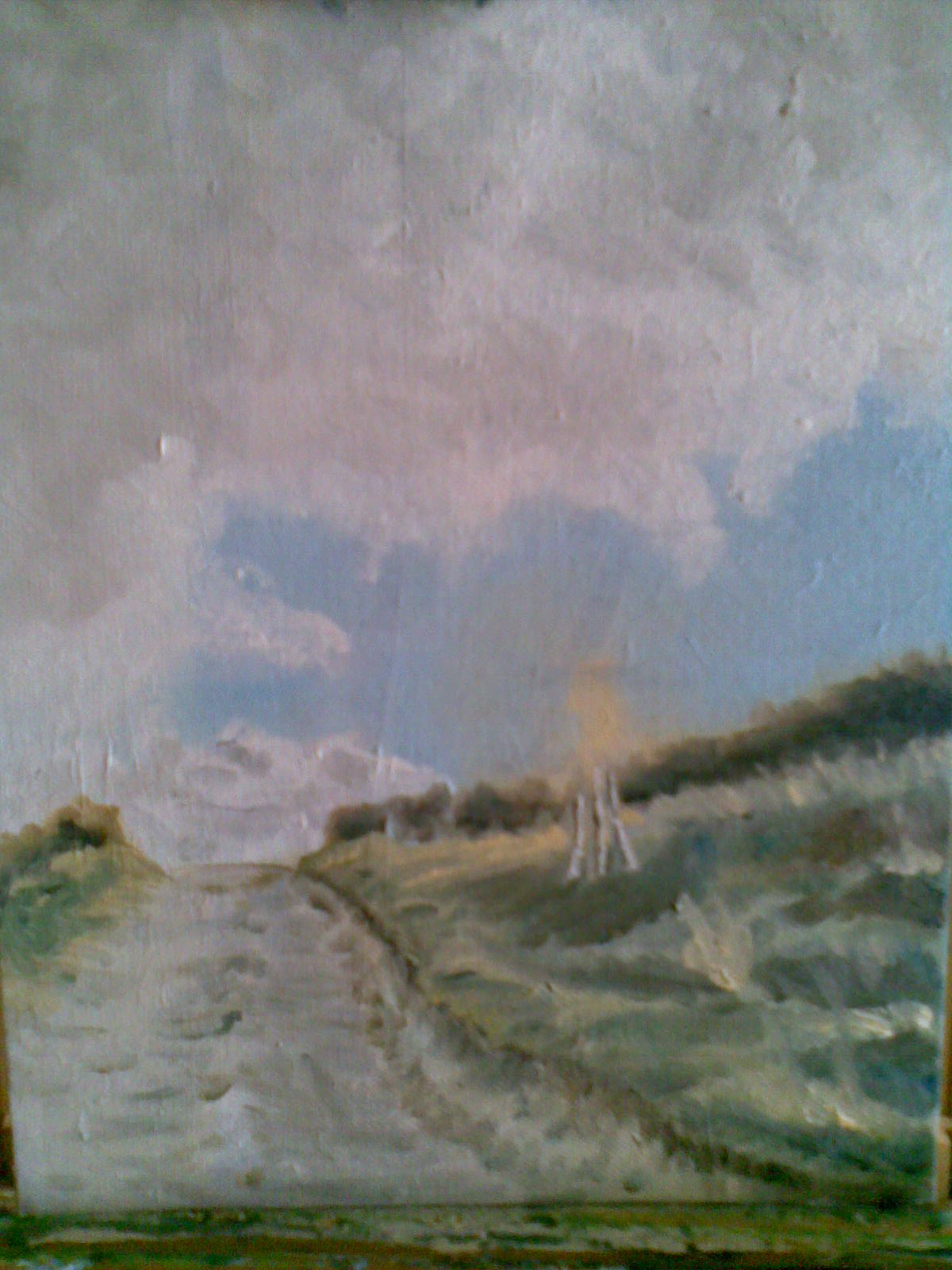
This is based on a photograph (yes, I'm still working from photos, sorry) that I took while out running. I couldn't resist this cloud formation and trying out the hotspot technique by placing Aldbury in the sun. I took a risk with demoting the land in favour of the sky but I think I just about got away with it.

It is amazing how effective the sunlit area is.  I had the painting on the easel for a couple of weeks with just a dull green and blue middle ground and the whole picture looked flat and uninteresting. I particularly the like the natural greens and browns in the sunlit patch.  There is something soothing about them.


Saturday, 29 January 2011

Painting No 12 - Swaledale Rams Head


Oil on  hardboard.  11" x 9"

I've always fancied painting one of these marvellous animals with their wonderful horns.  I finally found some excellent photographs on Mike Watson's blog (here and here).  It's primarily a bird-watching sight but Mike throws in a few other subjects as well.  He gave me his permission to copy the above.  Thanks Mike.

I'm generally pleased with the result but once again I was a tad over ambitious.  Those horns are massively intricate in real life (see photo in first link above), which is one of the attractions but poses a serious challenge for someone trying to loosen up.  All in all not a bad result.  I quite like the fact that it's not an exact copy.  The tones on the paints seem to add to the overall effect.  I may have a go at one of Mike other sheep (and maybe a bird or two) later on.

Sunday, 14 November 2010

Painting No 10 - Autumn Flames on Ivinghoe Beacon


Oil on canvas board, 8" x 10".

This was a quick one (2-3 hours) based on a photograph I took last week while walking the dog. I was struck by the gorgeous yellow trees (a cluster of three small silver birch) in an otherwise drab landscape.

I used a canvas on which I'd attempted a scene of frost and mist last year sometime. I gave that up as a bad job.

I found this one interesting in terms of the composition as the hedge and pathway take the eye across to the left hand side. The trees help balance that and draw the eye back. This is demonstrated by the incomplete painting below without the trees.


Having put the tree in the picture still wasn't properly balanced so I added some figures (my daughter and dog) from another photograph.

I left the forground in a fairly crude state as I didn't want to overcook it. I'm pleased with the result although it may be a little weak at the bottom left.

I think I need to develop a more interesting signature.

Saturday, 13 November 2010

Painting No 9 - First Steamer of the Morning, Ullswater


Oil on hardboard, 20"x 13"

Once again I'm attempting difficult lighting conditions. Still working from photographs, this one was very misty so I had to lift the background out of the haze a little by making the colours stronger. I had to redo the foremost hill after making it too orange but I quite like the overall effect now it's finished. I'll be sticking to brighter lights for the next few. I moved the steamer near to the centre to balance with the island.

This painting, for my friend Sally, is the first of, I hope, many many more of the Lake District in North West England. I aspire to become a mountain painter. Having said that these mountains are not typical of what I hope to do due to the hazy mist.

Ullswater is thought to be the lake by which William Wordsworth saw the daffodills that inspired the poem of the same name. Here's the first verse:

I wandered lonely as a Cloud
That floats on high o'er vales and Hills,
When all at once I saw a crowd,
A host, of golden Daffodils;
Beside the Lake, beneath the trees,
Fluttering and dancing in the breeze.

Incidently this was written in Grasmere in 1804 the year before my great grandfather Joseph Wren was born in Grasmere. It's a small world.