Wednesday, 20 June 2012

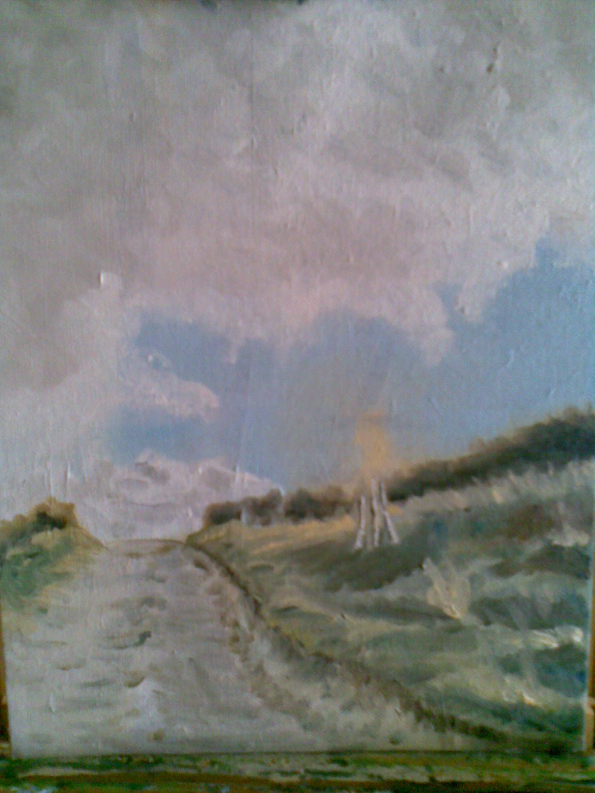
Painting No 21 - Bridgewater Monument across Aldbury Common


Oil on board - 10" x 8"

Yet another picture taken while on a run.  The trees and monument looked great against the dark sky.  I tried to focus on the tonal values in this one.  Whilst it has largely worked I did find the sky a bit tricky (to keep the values light enough) although I'm pleased with the final result.  I ended up by rubbing the sky over with a kitchen towel to get the edges to blend. I also rubbed backed to the underlying gesso to get the highlights in the clouds.

I stayed very loose with the plantlife in the foreground.  I think any more detail there would have detracted from the overall composition.

Compositionwise, I used a very useful iPad app called  Value Viewer from Plein Air to find the golden mean (although I could have easily measured it at 0.618 x length (or width)), and placed the monument on the vertical GM and the bottom of the right hand trees on the horizontal GM.  It does seem to work.

My numbering system for my paintings has collapsed as I now have two other paintings on the go plus a finished value study for one of those paintings.

Wednesday, 6 June 2012

Painting No 20 (take 2) - Aldbury in the Spotlight

The original version of this (see previous post) was nagging me.  The sunlit area just wasn't strong enough to overcome the massive cloud formation.  So I expanded it (and also added some colour to the clouds and added a few sheep while I was at it).  I'm much more pleased with this.  It is much more balanced.


Sunday, 3 June 2012

Painting No 20 - Aldbury in the Spotlight


Oil on Canvas Board  18" x 24"

This is based on a photograph (yes, I'm still working from photos, sorry) that I took while out running. I couldn't resist this cloud formation and trying out the hotspot technique by placing Aldbury in the sun. I took a risk with demoting the land in favour of the sky but I think I just about got away with it.

It is amazing how effective the sunlit area is.  I had the painting on the easel for a couple of weeks with just a dull green and blue middle ground and the whole picture looked flat and uninteresting. I particularly the like the natural greens and browns in the sunlit patch.  There is something soothing about them.


Monday, 9 April 2012

Painting No 19 - Rosie on Whangamata Beach, NZ


Oil on canvas board - 24" x 18"

Another picture I'd been wanting to do for a long time.  It is also conveniently very similar to the picture we did on my recent course.

I applied a few (by no means all) of the techniques I'd learned from my course, not least of which was to take some artistic license.  Previously I'd largely relied on choosing the right picture to copy to get the composition right but his time I rearranged the picture by compressing it laterally.  The beach is a lot wider in the source picture so I left out the middle section to narrow it.  This meant that I had to reorientate the pools on the left to get the perspective back.

We were taught that lighter colours (tints) help give the impression of distance compared to darker (shades) so I made the beach in the foreground much darker than it appears in real life while gradually lightening it as it receded.  I think it works.

I also used impasto in the nearest waves to give the impression of closeness.  This was made of titanium white paint mixed with chalk.  (I made the chalk powder myself by simply grinding down some pieces of chalk I picked up while out on a run.  We live in the Chiltern Hills so are sitting on millions of tons of the stuff.)

Another technique I used was to apply a light scummble over the sky and the central hills to recede them a little.  (The glare at the top of the picture is not from some Turneresque skill of mine. It's from a light bulb just above the picture).

All in all I'm quite pleased with this (especially as I survived painting my wife from behind!).  It's possibly not as ambitious with the indirect painting techniques as it could be but it's a good start.

Paintings Nos 18a-e Simply Oils Painting Course

Well I'm back from the painting course at Norfolk Painting School.  It was a 3-day course called Simply Oils which, as the name suggests, is for new painters.  You can read about the course and the school here so I'll give a brief summary here.  Suffice to say it easily achieved my objectives of giving my painting a kick up the backside.  The course was built around teaching the indirect painting technique which essentially consists of painting in largely transparent layers, allowing the underlying layers to show through.  Martin Kinnear who runs the school is a very passionate and patient teacher (as well as an excellent artist) and I'd recommend the course to anyone wanting to break out their amateurish ways and open the door to proper oil painting.

Beach Scene - Oil on Canvas 30 x 24

This picture was the final piece of the course and took most of the final day.  It utilised all of the techniques and method we'd learned in the previous two days.  The foreground is rushed but the required effects still works. I particularly like the lower clouds with their mix of purples, yellows and whites as well as the salmon underpainting coming through. The overall style is clearly very different to my previous work.  A series of smaller sketches were produced during the previous two days all leading to the above picture.  I struggled to get them done in the time allowed.  They are shown below in reverse chronological order.

Beach scene sketch - Oil on Board 12 x 10

This was a preliminary sketch for the large beach scene above. 

River scene sketch - Oil on Board 10 x 12

Turner's Fishermen upon a Lee Shore in Squally Weather sketch
Oil on Board 12 x 10

The pink base layer is clearly visible under the clouds lending them a light that would be very difficult to achieve any other way.   


Turner's Fishermen upon a Lee Shore in Squally Weather 
monochrome sketch (tonal study)
Oil on Board 12 x 10


A great deal was learned on the course.  It was only 3 days but it raised my awareness to whole new level so that I can come away and study and practice these techniques.

Sunday, 4 March 2012

Painting No 17 - Tree, Cleeve Hill


Oil on Canvas 16" x 12"

I've been wanting to paint this lovely solitary tree ever since I saw it on a walk with friends on Cleeve Hill in the Gloucestershire Cotswolds about 5 years ago.

I'm very pleased with the overall effect of this one.  The deep blue sky is almost pure Cerulean Blue.  I initially did the sky using rough multi-directional strokes but this didn't work.  The rough surface made the sky look close so I re-painted it using smooth horizontal strokes.  I think this works very well.  The tree stands out nicely on the distant sky.

My daughter Lucy has asked for this and, as it's her birthday tomorrow, how could I refuse.

This will be my last painting before I go on a painting course at the Norlfok Painting School.  I wonder what effect this will have on my painting style.  A positive one I hope. Watch this space.  

Saturday, 28 January 2012

Painting No 16 - Dave on the Really Wild Boar


Oil on canvas board 18" x 14"

I've been intending to do this for ages, for over a year in fact.  It is a surprise present for my mate, and mountain marathon partner, Dave on his 50th (today 28/1/12), which is why I couldn't publish it until now.  I nearly started it last year thinking his 50th was a year earlier.  Good job I checked on Facebook. Ironically I left it until the last minute having only painted it last weekend.  I had to do a touch up during the week to make sure it actually was recognisable as him.  I suppose that makes it my first miniature portrait as well.


This is hopefully the first of many fell and mountain running paintings.  The combination of runners and mountains makes (in my mind anyway) a brilliant combination of scenery and action. 

I'd managed to find a number of photos of Dave on the internet, largely by slogging through the photos of events that I knew he'd entered.  This one is on the Really Wild Boar fell race near Sedbergh. There were better action shots with better views but this one attracted me because of the contrast offered by the shadows and sunlit areas.  The composition is quite nice too. I'm quite pleased with the looseness of the shadowed area on the right.  He didn't really have race number 50.  I thought it appropriate to take a bit of artistic license and change it.

All in all I'm a happy bunny with this.  Happy Birthday Dave!

P.S. If any runners have found their way onto this page you may be interested in my running blog.

Monday, 25 April 2011

Painting No 15 - Whiskey


Oil on canvas board 10" x 12"

This is the recently departed dog of my Aussie cousin (once removed) Lorraine.  I did it as a present as Lorraine was about to visit.  I'd been looking for a photo of one of her dogs for a while but none had the right lighting conditions until this one appeared as Lorraine's Facebook profile picture.  The back lighting struck me as been very effective. 

Unfortunately, my lack of skill in painting wet-on-wet let me down as I just couldn't get the bright sunlit edges around Whiskey to be bright enough.  The white paint kept mixing with the underlying coloured paint.  Having said that, I think the overall result is fine.  Due to the tight time constraints (I started it the day before Lorraine was due to arrive) I was forced to stay loose and not dwell on the detail.  It apparently looks like the subject as Lorraine shed a tear when she saw it.  What more confirmation does an artist need?

Just got to wait a few months before I can varnish it and send it off to Oz.
 

Friday, 18 March 2011

Painting No 14 - Troutbeck

Oil on canvas board 16" x 20"

I do like to make things difficult for myself. I was looking through an old 1930's guide to the Lake District when I saw this scene in a small monchrome photograph.  The overall composition really appealed to me. 

There was obviously no colour so I took a look on Google Streetview and immediately found the house.  Unfortunately I couldn't get the view into exactly the same position and it was a winter shot.  It also looks like there's a lot of foreshortening in the original photograph. 


 So, I had a go anyway.  I left out the dog as I couldn't make it out in the original and didn't want to risk spoiling it.  I'm relatively pleased with the overall result but am a little disappointed that I still can't relax the detail.  The result is a mixed bag of styles (compare the tree trunk and the house) but then again it's all subjective hopefully some will like it.

Thursday, 3 March 2011

Painting No 13 - Portrait of the Artist as an Old Man

Oil on Canvas Board 16" x 12"

Well this one was a surprise.  As I was doing it I thought is was going to be a complete disaster but it suddenly all came together and I quite like it now.  I thought I was going to have to come back to it (never a good idea) but I'm going to leave it as it is.  The more I look at it the more I think it looks like me.  Not a pretty sight I know but we can't all be pin-ups and ,yes, my ears really are that big.  Not bad for a first portrait.  Think I'll do some more.

Saturday, 29 January 2011

Painting No 12 - Swaledale Rams Head


Oil on  hardboard.  11" x 9"

I've always fancied painting one of these marvellous animals with their wonderful horns.  I finally found some excellent photographs on Mike Watson's blog (here and here).  It's primarily a bird-watching sight but Mike throws in a few other subjects as well.  He gave me his permission to copy the above.  Thanks Mike.

I'm generally pleased with the result but once again I was a tad over ambitious.  Those horns are massively intricate in real life (see photo in first link above), which is one of the attractions but poses a serious challenge for someone trying to loosen up.  All in all not a bad result.  I quite like the fact that it's not an exact copy.  The tones on the paints seem to add to the overall effect.  I may have a go at one of Mike other sheep (and maybe a bird or two) later on.

Tuesday, 16 November 2010

Painting No 11 - View from our Back Door

Well some you win and some you lose.  This started out as my first plein aire painting (from the safety of my back garden).  I managed to get the sky, house and main bushes done in about 20 minutes when I received a long phone call.  At the end of the call the sun had gone and it was freezing.  So, I decamped to indoors which is where it all went downhill.    

Using a photo of the scene I'd taken when the lighting was just right I continued to finish the painting.  Maybe the subject matter was too fiddly but I reckon I'm still unable to back off from the detail.  I think I'd lost interest in the end and rushed off the left hand side of the painting. The end result you can see above.

Back to the drawing board.

Sunday, 14 November 2010

Painting No 10 - Autumn Flames on Ivinghoe Beacon


Oil on canvas board, 8" x 10".

This was a quick one (2-3 hours) based on a photograph I took last week while walking the dog. I was struck by the gorgeous yellow trees (a cluster of three small silver birch) in an otherwise drab landscape.

I used a canvas on which I'd attempted a scene of frost and mist last year sometime. I gave that up as a bad job.

I found this one interesting in terms of the composition as the hedge and pathway take the eye across to the left hand side. The trees help balance that and draw the eye back. This is demonstrated by the incomplete painting below without the trees.


Having put the tree in the picture still wasn't properly balanced so I added some figures (my daughter and dog) from another photograph.

I left the forground in a fairly crude state as I didn't want to overcook it. I'm pleased with the result although it may be a little weak at the bottom left.

I think I need to develop a more interesting signature.

Saturday, 13 November 2010

Painting No 9 - First Steamer of the Morning, Ullswater


Oil on hardboard, 20"x 13"

Once again I'm attempting difficult lighting conditions. Still working from photographs, this one was very misty so I had to lift the background out of the haze a little by making the colours stronger. I had to redo the foremost hill after making it too orange but I quite like the overall effect now it's finished. I'll be sticking to brighter lights for the next few. I moved the steamer near to the centre to balance with the island.

This painting, for my friend Sally, is the first of, I hope, many many more of the Lake District in North West England. I aspire to become a mountain painter. Having said that these mountains are not typical of what I hope to do due to the hazy mist.

Ullswater is thought to be the lake by which William Wordsworth saw the daffodills that inspired the poem of the same name. Here's the first verse:

I wandered lonely as a Cloud
That floats on high o'er vales and Hills,
When all at once I saw a crowd,
A host, of golden Daffodils;
Beside the Lake, beneath the trees,
Fluttering and dancing in the breeze.

Incidently this was written in Grasmere in 1804 the year before my great grandfather Joseph Wren was born in Grasmere. It's a small world.

Saturday, 23 October 2010

Painting No 8 - Cape Byron


Oil on canvas board, 12"x 16"

Well I'm on a roll now. This one took four hours. It's from a photo taken by my second daughter, Lucy, while travelling in Australia. Cape Byron is the most easterly point in mainland Australia.

I really enjoyed this one. The sky was a pleasure to do. Simple gradations of white with a tiny touch of blue all the way up to cerulean blue. I tried to create the clouds by rubbing the blue away to expose the underlying white base but this was too weak so I painted them in with titanium white.

I like the smoothness of the sky and lighthouse next to the rough impressionistic cliffs and grass. Seems to work quite well.

The cliffs were tricky but in the end it came down to stepping back and checking the overall structure then every thing dropped into place. The grass was simply a case of making sure there were plenty of colours involved to ensure that it didn't look too flat.

I feel like progress is being made. Onto the next one.

Thursday, 21 October 2010

Painting No 7 - Theo


Having spent a year on the previous painting this one took a few days. The subject is our recently departed cat Theo (we also had to let another cat Ruby go this year). The painting is for my youngest daughter Polly.

I found this one very enjoyable. I seem to have got the knack of painting wet on wet. The secret is to simply just keep painting. If the paint doesn't stick then try thinning it out a bit. Also, more pleased with the style. Whilst it's still a bit tight I felt a lot more confident just slapping the paint on.

I kept the background extremely simple making the top dark to emphasise the highlights aroung Theo's ears and back. Seems to have worked.

Monday, 11 October 2010

Painting No 6 - Windgather


Well, this one took some time. It has been resting on my easel for about a year. Just didn't get time with working away from home. Ironically the scene is near where I was staying during the week. It is Windgather Rocks which are on the Derbyshire - Cheshire border. This was my running area while staying at Whaley Bridge. The hill in the background is Whaley Moor.

I finally got round to finishing it off today. Another irony is that it's the day after my running club (Goyt Valley Striders) held the Windgather fell race.

It felt good to add the finer detail and make it come to life. It's amazing how a few simple lines and a bit of highlighting and shadow (e.g. fence posts) can improve things. I kept the colours constrained to a few basic colours but was fairly free in their use across the whole painting. I'm fairly pleased with the final result but once again the paint is a bit thin and I made hard work of the rocks.

I'm a big fan of dry stone walls and there's one peeping over the bottom of the picture. Very pleased with this. They'll make more of an appearance in my future pictures.

Good to be back at the easel.

Sunday, 21 June 2009

Painting No 5 - Cottages, Buckmoorend


Now this one I like. I did it last week on a 12" x 16" canvas on board. Not perfect but not bad for my fifth attempt. It is still fairly tight but it works for me, largely I think due to the overall composition and mix of colours. It is from a photo I took whilst out running last year. The house just above the white cottage is the gatehouse for Chequers, the country residence of the Prime Minister.
I am starting to loosen up a bit. Click on the image and take a look at the bales in the foreground. These aren't as tight as I'd have done them a few months ago.
Progress of a sort.

Painting No 4 - Tring Summit, Grand Union Canal

I'm least happy with this from my attempts to date. Again I was trying to be too ambitious as I was trying to capture a hazy sunlight filtering through the trees and, as you see, failing miserably.

The two figures here are my first attempt at people and whilst they aren't brilliant they're not a failure either. I even got the black blob to look like our dog as well. Result.

I think I need to be a bit more bold and try a larger canvas (this one's a 8" x 10") but maybe try a simpler lighting effect.

Painting No 3 - Phoebe (Unfinished)

This is our dog Phoebe. The picture is unfinished as, still being a slave to the detail, I'm waiting to get hold of a large copy of the photo from which I copied this.


For this picture I tried following a technique from several Helen Van Wyck videos I borrowed from my mother. This involved sketching out the basic shapes and high and low lights using balck and white acrylic paint (as it dries very quickly) then refining the details and colours on top of that.


My starting sketch, which I did deliberately very loose, was hilarious.


The next stage was a bit better.


I eventually achieved something that actually looks like our dog and not just 'a' dog (althought the eyes are bit goggley)so maybe there's something in the approach.

Painting No 2 - Cottage, Aldbury Nowers

This is on a 10" x 12" canvas on board. I used a photograph that I'd taken whilst out on a dog walk.

Again, fairly pleased with this one. I managed to keep the pallette a bit more restricted, especially with the greens. It is still a bit tight but how do you paint a drainpipe without being tight? I waited until the grass was dry enough before using masking tape to help produce the straight lines for the fence. I like the effect of the lights and shadows on the grass on the drive in the foreground.

Overall, I'd like to be able to paint with more paint on my brush but I struggle to get sufficient on the brush without making it too lumpy. Maybe need to use a medium or solvent. More study required.

Painting No 1 - Grindsbrook 2008

I chose this for a couple of reasons, apart from liking the scene of course. This is where we scattered the ashes of my brother Tony, a brilliant but unrecognised wildlife artist. Also my mother, a tenacious amateur artist, has had a go at this scene in watercolours so I wanted to compare myself against her attempt.
I need to say at this point that unless stated all my paintings are done from photographs. I'd love to do plein aire but don't yet have the confidence.
For my first outing in oils (or any other medium in the last twenty years) I'm fairly pleased with it. I like the step at the bottom of the stream and the overall effect of the bottom left of the painting. I was probably too ambitious with this as a first attempt. I found the grass and bracken on the right hand side too difficult.

My biggest problem is going to be letting go of the detail. Any drawings I do are full of detail so it's hard for me to stand away from it.

My pallette had far too many greens in it and I got lost in these resulting in the patchwork you see above. I also need to get used to working wet on wet (largely due to lack of patience). I didn't realise how long these paints take to dry.